
Fly UX (Case Study)
Airline Booking Service
Overview
As part of my Diploma in UX Design with the UX Design Institute, I completed a case study for Fly UX — a fictitious start-up airline. The brief was to design a desktop flight booking experience that feels fast, intuitive and easy, and could realistically compete with established airline websites. I worked through the full UX process, from research and analysis through to interaction design and prototyping.
Problem
Booking a flight takes longer and is more confusing than it should be. Fly UX needed a flow that helps users search, compare and select flights without friction.
Project Goals
Create a booking experience that feels fast, easy and intuitive, delivered as a clickable prototype plus wireframes for developer handoff.
My Role
I worked as the sole UX researcher and designer, using my own research alongside course-provided usability test recordings.
Process
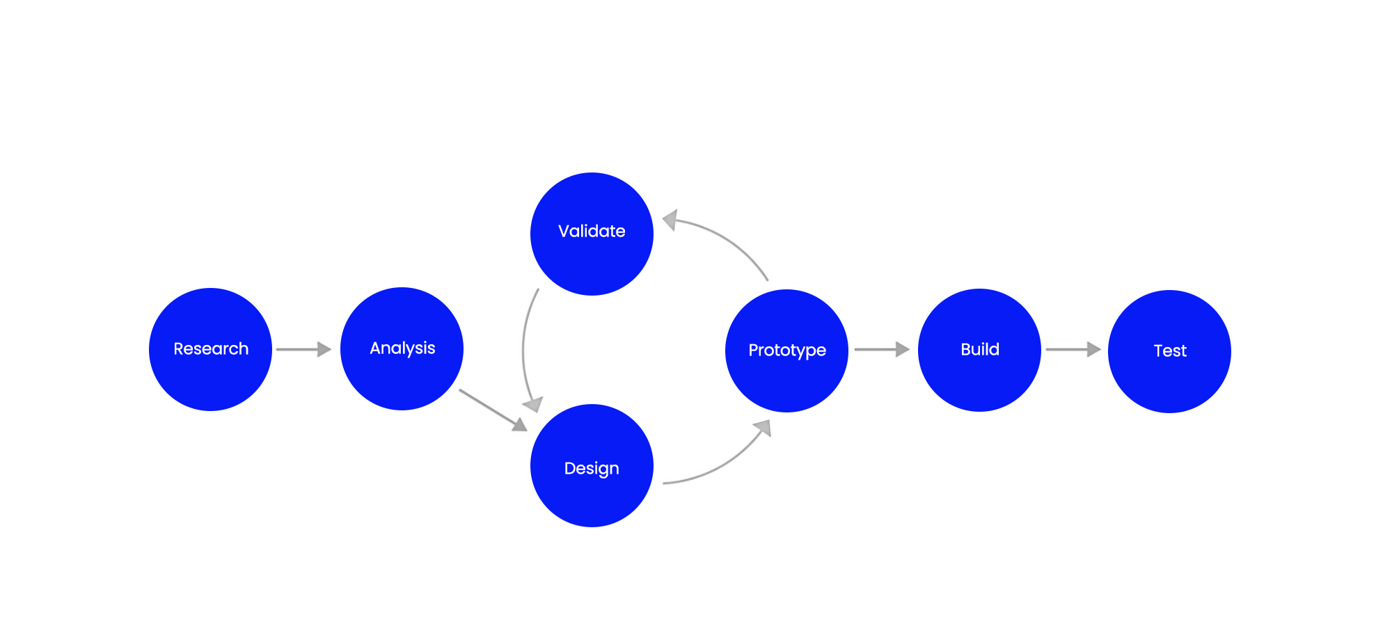
This project followed a standard UX workflow: Research → Analysis → Design → Prototyping → Wireframes.
In real-world projects, the process usually loops: you prototype, test with users, refine the design, and repeat until the solution holds up. For this course project, the structure stayed mostly linear so I could demonstrate each stage clearly and produce the required deliverables.
I started with research to understand user goals and pain points, then moved into analysis to synthesise the findings and define the key problems to solve. From there, I progressed into design, translating insights into page structure and interactions, and built a clickable prototype to bring the booking flow to life. Finally, I produced wireframes to document the final layout and functionality for developer handoff.
Note: Due to the scope of this project, this project concludes at the wireframing stage (no build or live testing phase included).
Research
To understand the problem correctly, I started by researching how people actually search for and book flights online and what gets in their way. This stage grounded the project in real user behaviour and intent, so the design decisions that followed were based on evidence rather than assumptions.
Methods used:
Competitive Benchmarking
I benchmarked the flight booking flows of Rex, Emirates, Qantas, Delta, Orbitz, Ryanair and KLM, stepping through the key stages (search, results, flight selection, fares, add-ons and payment).
Objectives
To understand the conventions and mental models users already expect
To see how strong competitors handle the same booking tasks
To capture best practice (and common pitfalls) to guide what Fly UX should emulate, improve, or leave out
Key Findings
#1 Pricing transparency needs to happen early
Make it obvious what’s included, whether prices are per-person or total, and when extras are added.
#2 Extras and upsells are a major trust risk
Add-on prompts and multi-screen upsell detours annoy users and make the journey feel longer; extras should be easy to skip and kept contained.
#3 Results must be scannable for fast comparison
Price, times, duration and stops should be front-and-centre, with simple filters/sorting to support decision-making.
#4 Search should be easy to edit without losing your place
Users need to adjust dates, passengers and routes from results without restarting the flow.
#5 Fare tiers need clearer differentiation
Side-by-side comparisons work best; unclear differences between fares cause hesitation and errors.
#6 Checkout should include a clean, editable summary
Users want to review and change seats/bags/extras easily; the final steps should feel clear and controlled.
These findings became my guardrails for the rest of the project and I was genuinely surprised by how much the “trust layer” (early pricing clarity and the way extras are introduced) mattered just as much as the core search and comparison UX.
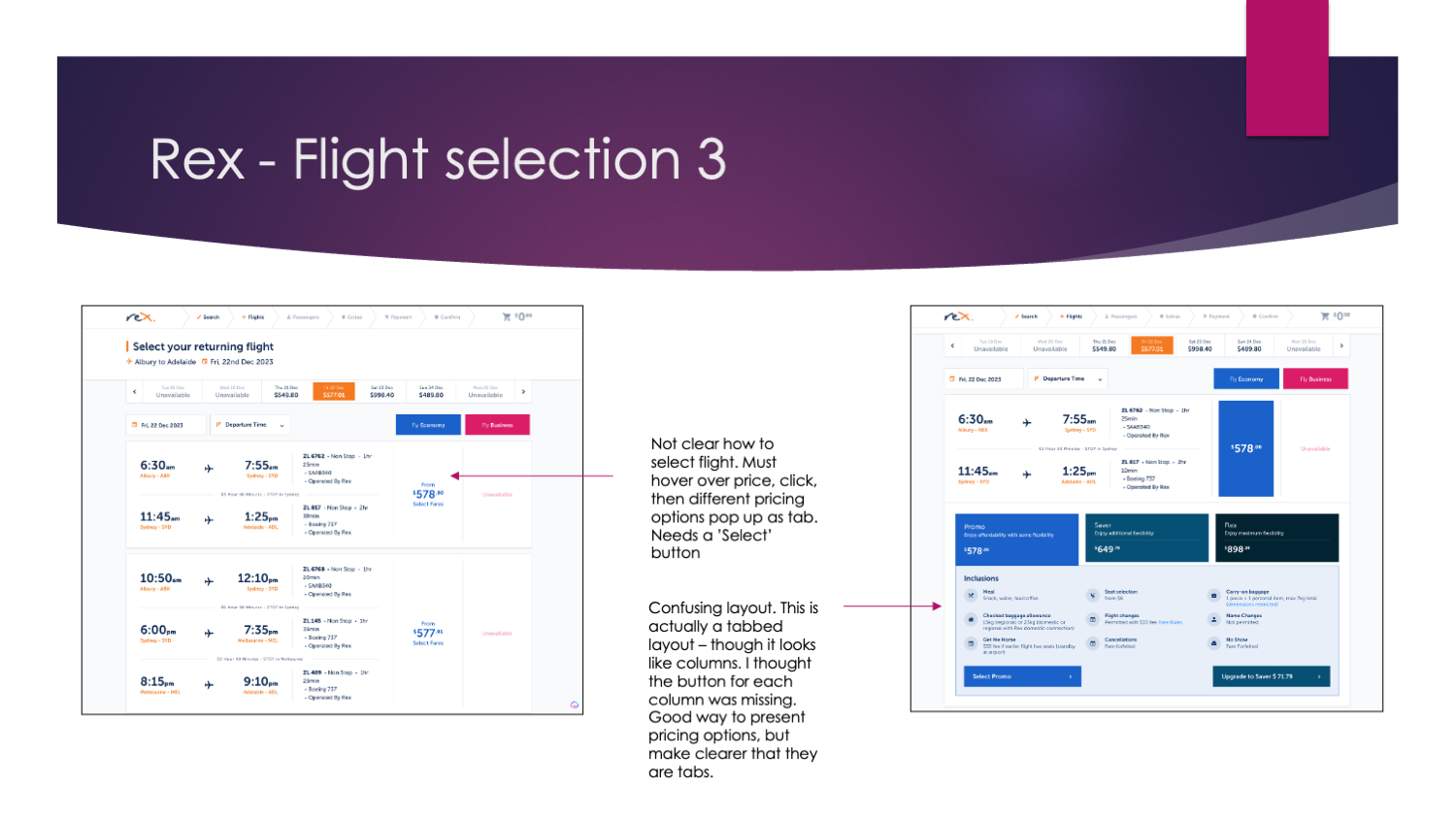
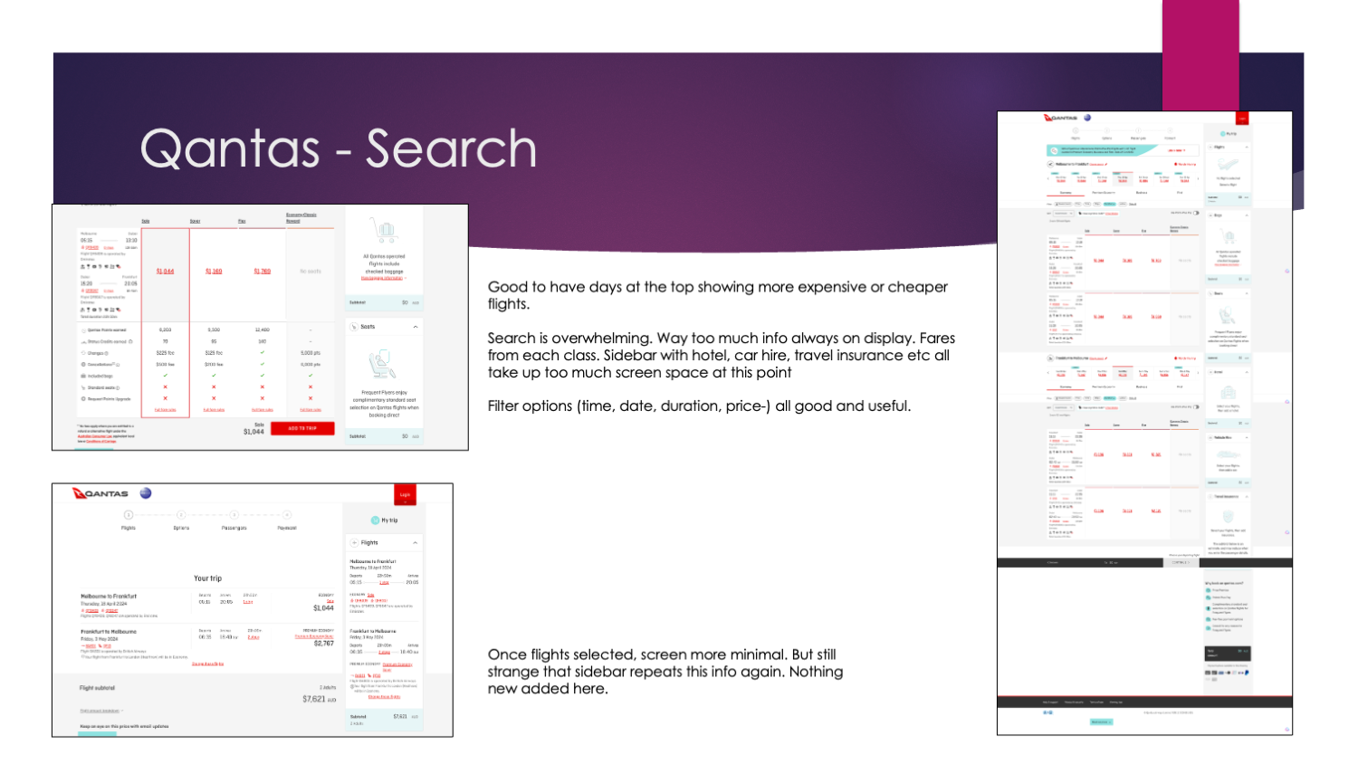
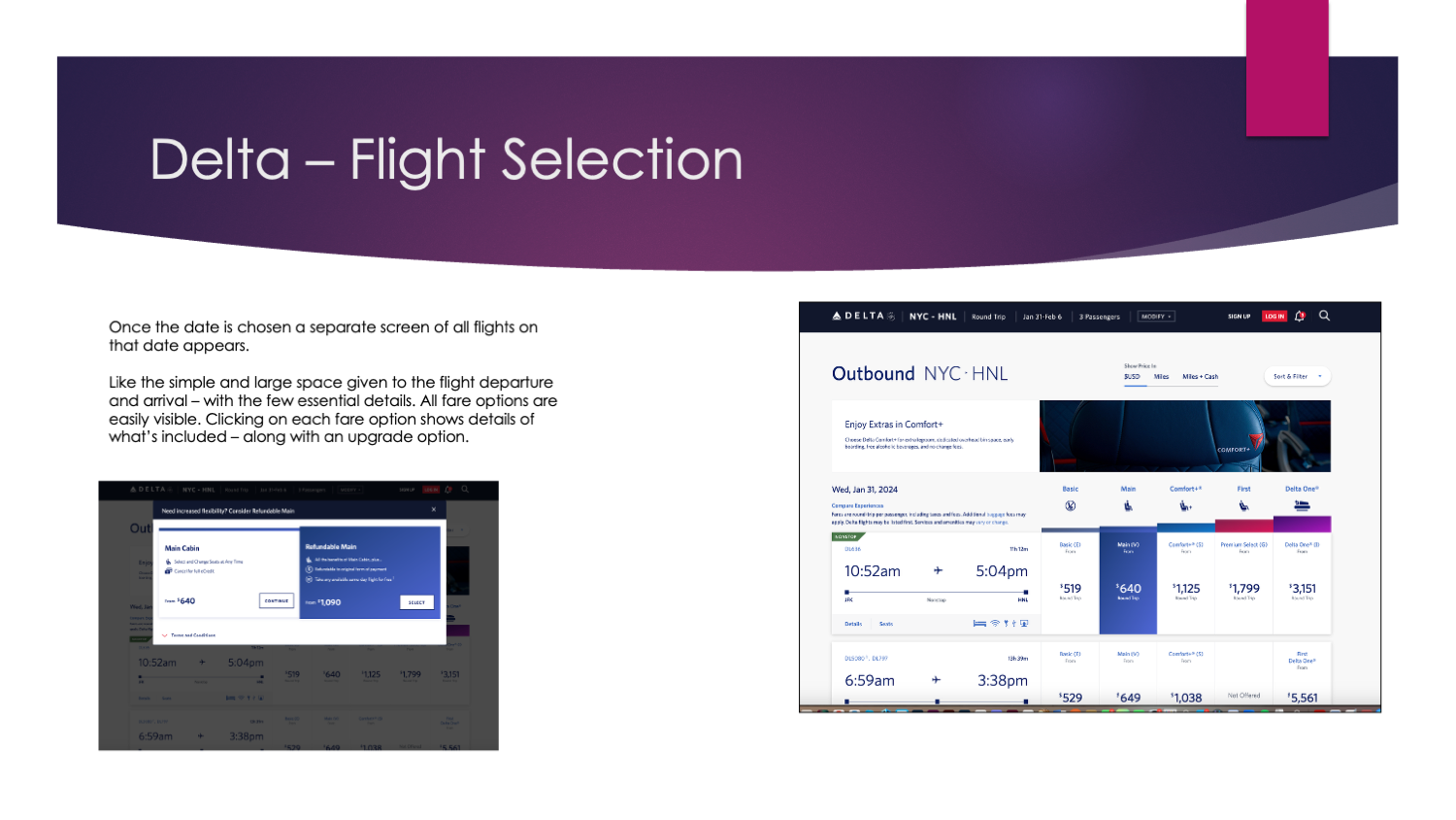
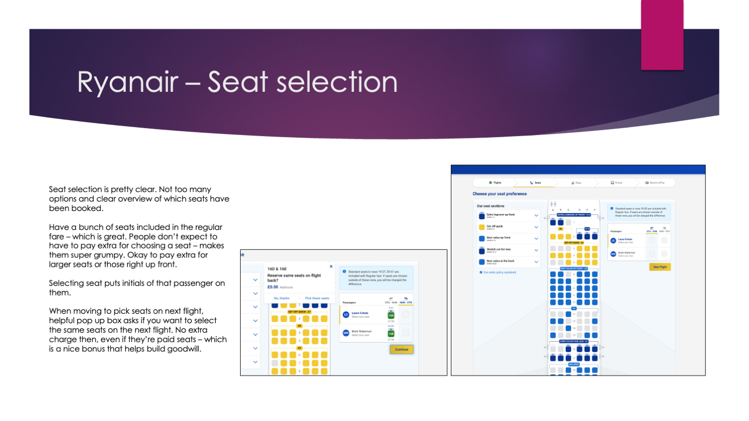
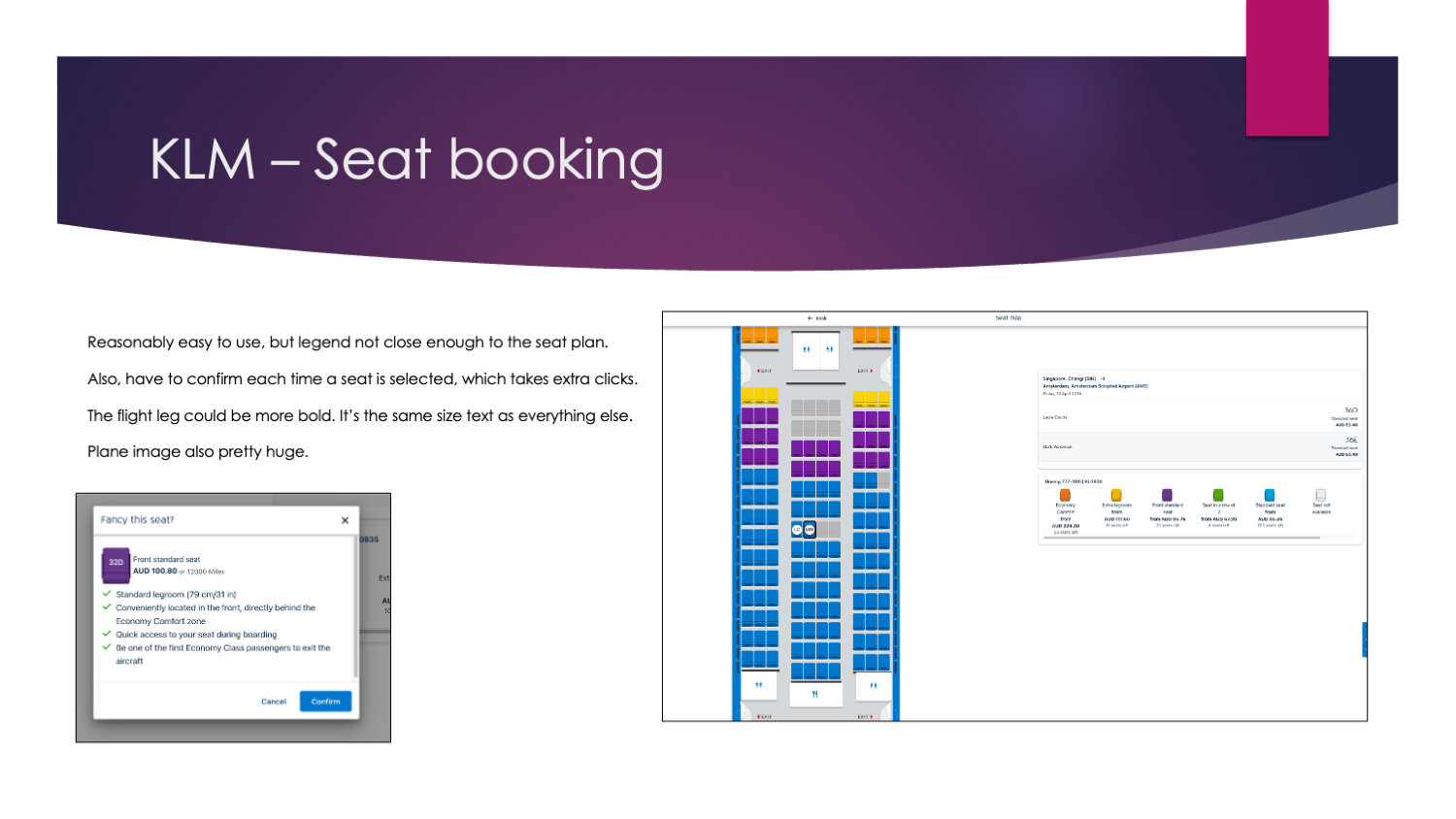
Screenshots from the competitive benchmarking process.
Online Survey
I created a 12-question survey in Google Forms using a mix of multiple-choice and open-ended questions. The questions focused on recent flight booking behaviour, goals when visiting airline sites, blockers, missing features, and preferred/disliked experiences. The aim was to quickly capture both patterns and comments from a broader mix of users (10 responses).
Objectives
To better understand how people experience booking flights online, specifically:
What people visit airline websites/apps to do
Whether they can complete those tasks (and what blocks them)
What features help vs frustrate
What matters most when booking a flight (decision drivers)
What people would change in the experience
Key Findings
People use airline sites for more than booking: booking, deals, check-in/status and managing bookings all came up.
Half completed their task easily; the rest had difficulty or couldn’t complete it.
The biggest friction themes were comparison effort (price/time/value), clutter/upsells, timeouts, and being pushed into extra steps/windows.
Most respondents had used an airline site recently, across desktop/app/mobile.
When booking, price and departure/arrival times were the main decision drivers.
Screenshot of some of the survey questions.
Usability Tests
Because Fly UX is a fictitious product, I tested competitor airline websites instead. I ran one remote desktop usability session using a scripted approach: a short interview first, then task-based booking scenarios. The two main tasks were booking a short-haul flight with Rex and booking a long-haul flight with Qantas. I supplemented these with two usability test recordings provided by the UX Design Institute (for Aer Lingus and Eurowings).
Objectives
Observe real booking behaviour and decision-making in context
Understand users’ mental models and expectations at each step
Identify friction points to avoid repeating in Fly UX
Check common conventions against Fly UX principles (clarity, smooth navigation, user-centred functionality)
Key findings
#1 Users start by comparing, then switch to booking
Early focus is prices/dates/times; once committing, it’s luggage/options + finishing quickly.
#2 Search got buried
Large banners/popups pushed the flight search down, so some users went hunting through navigation.
#3 Next steps weren’t always obvious
Key actions didn’t look clickable or clearly “the way forward” (Search Flights, select fare, proceed).
#4 Dates caused confusion
“Outgoing/Return flight” labels and DD/MM/YY placeholders led users to miss fields or type dates manually.
#5 Results layout confused people
Some users misread times or didn’t understand the date/price scroller.
#6 Pricing wasn’t clear enough
Users hesitated when it wasn’t obvious per-person vs total, or outbound vs return.
#7 Extras/luggage created the most frustration
Add-ons and “flex/hold” type options slowed people down and annoyed them.
#8 Popups were mixed
Helpful when preventing mistakes (e.g., airport mismatch), frustrating when unnecessary or hard to close.
What surprised me most was how consistent the friction was across all three methods. In usability testing, people didn’t struggle with the idea of booking: they struggled with clarity: finding the search, knowing what to click next, and understanding what the price covered.
Those same themes showed up in the benchmark (pricing, scannable results, contained extras) and the survey (clutter, comparison effort, extra steps), which gave me confidence these weren’t one-off issues and set clear focus areas for the next analysis phase.
Usability testing video

Analysis
After gathering research, I organised the findings into an affinity diagram to pull clear themes from messy data, then mapped them into a customer journey showing key stages, user goals, actions and emotions.
Methods used:
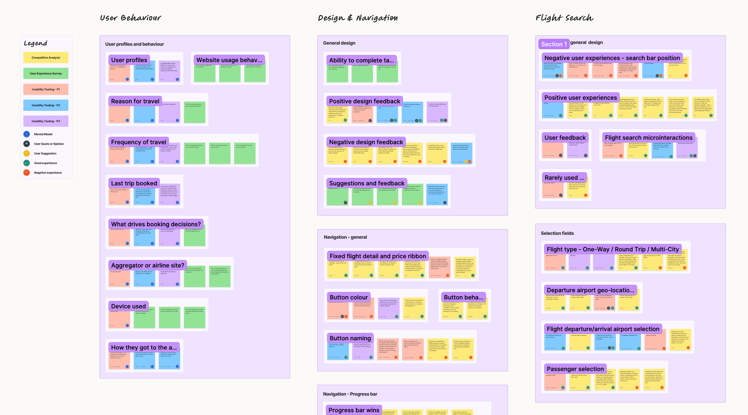
Affinity Diagram
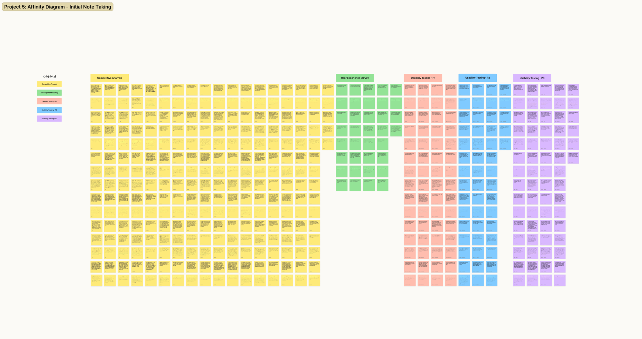
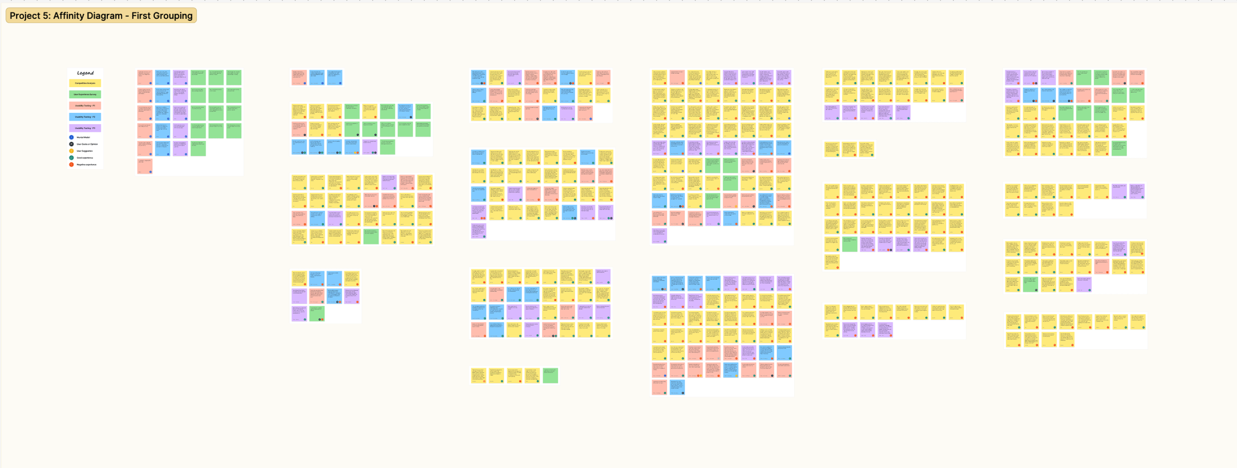
With the research done, I needed to make sense of a big pile of mixed observations — survey responses, usability notes, and competitor walkthroughs — and turn them into themes I could actually design from. With the help of a peer reviewer, I used an affinity diagram in FigJam to sort everything into clear patterns across the booking journey.
Objectives
Pull all research observations into one structured view
Surface repeating user behaviours, pain points, and decision drivers
Identify the highest-friction moments in the booking flow
Produce a clean set of themes to carry into journey mapping (next step)
Process
I worked in three passes: first I captured raw observations as individual sticky notes (colour-coded by source), then grouped them quickly by similarity to let patterns emerge, and finally refined the clusters, removed duplicates, and organised them into journey stages plus a few cross-cutting themes (like navigation and pricing clarity).
Key Patterns
Search is often missed or confusing when it’s pushed down the page or labels aren’t explicit.
Flight selection slows down when results aren’t scannable and fares aren’t clearly differentiated.
Passenger entry is smoother when details are collected earlier and contact-person logic is clear.
Seat selection breaks flow when leg context and legend/pricing aren’t obvious.
Baggage/extras create friction and distrust when inclusions are unclear and upsells cause detours.
Review/payment overwhelms users when the page is long and edits aren’t easy.
Navigation clarity matters throughout: strong CTAs, visible progress, and minimal disruptive popups.
What surprised me most was how often users didn’t get stuck on “hard choices” — they got stuck on orientation: what’s selected, what’s included, and what to do next. Small UI issues (buried search, vague labels, weak CTAs) created outsized friction.
These themes now feed straight into the Customer Journey Map, where I’ll plot goals, emotions and pain points by stage and pinpoint the highest-impact fixes to carry into design.
Customer Journey Map
Building on the affinity diagram, I created a Customer Journey Map to show the most common booking experience end-to-end. I defined the high-level steps, set up swim lanes for goals, behaviours, mental models, positives and pain points, then populated each stage using evidence from competitor walkthroughs, survey responses and usability testing. I also added short user quotes and an emotion curve to make the high-friction moments visible at a glance.
Objectives
Turn the affinity diagram themes into a clear, journey-based view
Capture goals, behaviours, mental models, positives and pain points across each step
Create a clean baseline of the current journey (no solutions yet)
Findings
#1 Pricing clarity = trust
If totals/inclusions (and per-person vs total) aren’t obvious, people hesitate and doubt the flow.
#2 Search + results must be fast and scannable
Users expect quick input, strong filters/sorting, and easy comparison; slow or messy results frustrate early.
#3 Fare choice is a comprehension issue
Make tiers/inclusions explicit and comparable—without it feeling like an upgrade trap.
#4 Forms need to be minimal
Passenger entry drags when it’s long, error-prone, or contact/special-assistance logic is unclear.
#5 Seats/bags/extras break flow when context is missing
Unclear flight-leg context, surprise pricing, pop-ups, and upsell detours spike stress and fatigue.
#6 Review + payment should be a confidence checkpoint
Clean, itemised summary + easy edits; anxiety rises with clutter, last-minute fees, or weak confirmation.
Customer Journey Map. Click to see detail.
Design
After analysing the collected information, a solution started forming with the overall objective to fix the issues uncovered during my research.
Flow diagram; Interaction design - sketches; High-fidelity prototype; Wireframes
Flow diagram
First, I created a high-level flow to understand how users will flow through my design. The goal was to put down every interaction and reaction I could expect in a common user journey. Details of the final product were also added to help shape the second phase, the interaction design.
Onto the design stage, and the initial part was to map out user's flow through the site. This started at the homepage and finished at the checkout stage. I tried to make the flow as simple as possible while addressing the pain points that were highlighted in the earlier projects.
Before I started sketching or designing, I put together a user flow diagram to get a better idea of the high-level flow for booking flights on my new airline website. While creating the flow, I tried to address as many uncovered issues during the research phase.
I found this very useful to get a better understanding of the screens that the user will soon walk through, and the actions that lead up to booking a flight. Also, this gave me a very structured representation that I used as the groundwork for my designs.
The design phase began within defining the flow. I used the findings made in my research and analysis to define a high level flow for a single use case. I began the process by making several sketches of the flow which allowed me to quickly translate my ideas and thoughts to paper.
With every sketch I was able to refine and address the issues that where uncovered in my research. Once happy I recreated the flow digitally, fine tuning the small details.
INSERT IMAGE
Interaction design - sketches
From the flow overview, I then started sketching the website, trying out solutions to the issues and pain points users have voiced.
After determining user flow, it was time to put everything together in the form of sketches. These sketches would roughly outline the look and feel of interaction with the Fly UX website.
Like the user flow diagram, the sketches were designed to consider the user goals, behaviours and paint points that were discovered during the research and analysis phase.
After a few different attemps to get the design correct, I settled on the sketches shown below.
Based on the flow diagram, I transitioned into solution mode.
In a first phase, I created some rough paper sketches, which I kept improving and improving – with the help of my arts & crafts toolbox – until I had my first low-fidelity wireframes.
Preliminary low-fidelity screen designs were quickly sketched. They were further refined and added to the user flow diagram to help visualise the interactions as the user moves through the booking system.
INSERT GALLERY OF SKETCHES
Medium-Fidelity prototype
The main goal of the design is to address the common pain points of lack of transparency of information. I designed the prototype with simplicity and transparency in mind. Try it here.
The next stage of the process was prototyping. Once I was happy with the interaction design I got started. I decided to go with a medium/high fidelity prototype, as these prototypes have the ability to convey richer interactions from the user and gain greater data and insights.
The design then went through more user testing to either validate or find flaws in the design.
While using all my previous references, I build a medium fidelity prototype following the guidelines shown in the lessons of the UX Design course.
After many iterative steps, improvements and testing, I finally delivered a full clickable prototype that I’m proud to present.
N.B. As this is a prototype, not all of prototype is interactable, however hints are given if needed. It is also important to note that I have designed the prototype with UX in mind and in the real world, the UI would need some tweaking.
After defining much of the solution through my flow diagram and sketching I created an interactive website prototype. The prototype was built with all of the necessary detail and interactions to test the high level flow, screen layouts, text and interactions.
The process was relatively straight forward as I had defined each screen states in detail during the previous exercise.
Annotated wireframes
As this was a fictive project to obtain my UX Diploma, a real implementation of the application was never in scope. However, the final exercise included the creation of annotated wireframes as if we were to showcase our designs to a team of developers. By creating those annotations, I got to think about all the different states of interactivity of the screens and elements used in my design.
Writing the annotations really helped me to discover potential deviations of the happy flow and made me think of different solutions to cope with these exceptions.
The final step consists of wireframing the design with enough information to pass on to developers so the final product acts and reacts as designed.
The Final stage of UX process is to produce high quality wireframes as part of handover documentation for developers, and in some situations, UI designers too. All pages, components, states and interactions need to be explained and made clear as to avoid any guess work.
Below you can see my final wireframes for Fly UX.
The final piece in the puzzle after all the research, analysis, design and prototyping was to prepare the document to hand over to the development team. Close attention to detail and labelling was crucial to ensure a smooth hand over to the development team, so they do not need to guess or fill any blanks. I added a layer to my Figma prototype to create my wireframes then moved them over to a powerpoint for the handover document.
Final thoughts and learnings
Ultimately, this project was developed for one user. If I were to move this forward, I would have tested and re-tested with more users in order to gain more comprehensive feedback before delivering the wireframes.
Overall however, this project was extremely useful to put theory into practice. I further developed my customer-centered focus on users, and designed a solution to alleviate pain points and challenges. It has reinforced my decision to focus on UX as my new career path.
This project was challenging although very rewarding. It gave me a very hands-on experience of a UX design use case in which I acquired extensive knowledge related to all steps of the design process. Not only did I discover the importance of research, but I also discovered new technical skills while designing and thereby using different design tools.
What I learned
I enjoyed following the UX process, solving problems and building empathy with the user to fully understand their wants and needs. I was able to develop a UX toolkit for future UX projects and adopt a user first mindset to create a digital product with a positive experience.
The whole project was a huge learning experience, if I could start it again I would conduct more research. Specifically I would conduct more usability tests, the insights I gained were vast and they gave me the confidence that I was solving real user issues.


